At the moment, I wrap all of my items in tissue paper and then add a ribbon and a label. That's it. Best part? The ribbon doesn't even go with my brand colors. While it doesn't look bad, it just doesn't fit my overall brand theme, which is clean, simple and modern. If you order something from me today, this is most likely how your item will arrive:
Not bad, but not amazing either.
When I first started my business I was definitely concerned with the costs of everything and so my packaging evolved out of items I already had on hand, which was cost effective. As time has gone on, I have realized that part of operating a business means spending money; you know the phrase "you have to spend money to make money". So the past few weeks (ok, you got me, it's been months) I've been investing in my company. The next investment I need to make is in the packaging department.
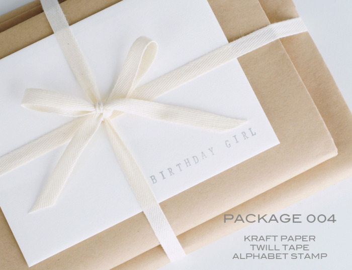
Here are some pictures (thank you pinterest!) that are helping me make my final packaging decisions:
 |
| Sally J. Shim |
 |
| Bakers Twine from Cute Tape |
 |
| originally spotted on The Dieline |
 |
| from Oh, Hello Friend |
So there you have it, my inspiration for meeting my goals during project "revamp packaging". I plan on sticking to my colors of white, orange, cream and aqua - while using fun little details. All to ensure that, when receiving an order from Believe Notes, it's almost too pretty to open. Almost.


nice one
ReplyDelete